DailyUI Challenge - Day 001: Sign Up/login page
Your Ads Here
The DailyUI Challenge has begun! Yipee!
It's Day 001 of 100.
Challenge: Create a SIGN UP page.
The sign up page is one of the most engaging page in a website especially on membership websites. This page is probably the second most active if not the most active page on sites like: Facebook, Twitter, Instagram, Pinterest, Medium etc.
I was given the challenge to create a sign in page or a sign up page using modern best practices.
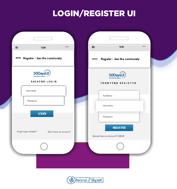
My Sign Up UI Design
 |
| Sign Up UI Design by IFEANYI EKPERI #DailyUI |
This UI design features the basic yet modern feel of a typical sign up page that aids the process of becoming part of a membership site without stress.
With it's new look and modern design, you're sure to fall in love at first sight.... Lol.
The Design Concept/Process
* The header:
This shows an 'arrow' pointing backwards showing that this button would lead back to a previous page which is most likely the Homepage.
* The Logo:
Having the Logo occupy the div between the header and content (body) of the design is a way to place ownership of the what the User is interacting with or the platform the User is about to either log into or sign up for.
* The Title:
This shows the page title, indicating what the form below is for and for whom.
* The Form:
This login form requires just your username and password while the sign up (as a first timer), requires you to state full name, username and password.
The sign up page/form was made very short to reduce the time the User spends being 'outside' your site. Other details may be required but that should be when the User has gained access to the site, hence, the short, concise and modern look/feel of the form.
Take for example these two scenario and choose which you prefer one you prefer:
First scenario:
You went visiting a friend and knocked on his door, you could hear his voice from inside the house asking 'who is that' (name), and you answered. He comes out and opens the door, stretching his hands of welcome and you both walk inside, then he engages you to know the reason for your coming.
Second scenario:
You visit a friend, after knocking you hear his voice from inside the house asking your for your name, you answered and the next thing, he asked 'what do you want?' and you answered and then he asked again ' how long are you willing to stay and why do you choose to come tell me about your predicament or who directed you to seek my advise'.
How would you feel? Not welcomed. Unconformable. Angry. Disappointed etc.
That's the same feeling Users get when they are asked all sorts of question (when they aren't really needed) on the sign up page, hence, more abandoned forms.
You might forgive payment platforms for using long forms because of KYC (Know Your Customer) rules. They are exceptions but they should be necessary questions only.
* Button:
Designing with inclusion rule number says, make all words as bold as possible and as clear as possible, hence, the auspicous button.
* Direction:
Did you miss your way? Get a direction either leading you to the sign up page if you don't already have an account or leading you to the login page if you already have an account of the site.
Please kindly rate, comment, criticise, correct and contribute to this UI design. This is my day one and I'll appreciate it.
A like/follow on my social media handles and DRIBBBLE would be awesome:
I Care!
#DailyUIwithIfeanyi
#BeYou100percent
Your Ads Here
Your Ads Here
Your Ads Here
Your Ads Here
Newer Posts
Newer Posts
Older Posts
Older Posts


Comments